Experimenting with Lettering
05 Oct 2014Like most people I know, I try to learn new things on a regular basis. Recently, I've been studying design principles and digital illustration. I've been passionate about great usability for a long time, but I've never taken the time to study the visual side of design until the past few months.
Over the past week, I've rewatched Jessica Hische's Passion Projects talk on side projects and "procrastiworking" and it finally dawned on me: I should finally carve out some time to actually make something with all of the design I've been absorbing. Also, since I was already watching Jessica's work over the week, focusing on lettering seemed fun.
I decided to put a line-based lettering twist on the Fastly brand. I wasn't using the Fastly design assets as reference, but I wanted to make something that refected us as a company, even if it was in a way that only internal Fastly folks would understand.
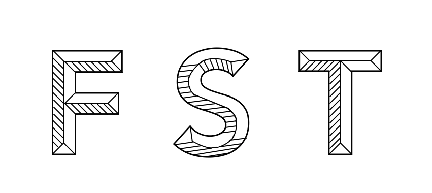
To give some backstory, many of our core internal systems are named with the phrase FST in the convention.
Some of these are FST-stats, FST-loader, ZD-FST; we're a creative bunch when it comes to system names. So,
it seemed fitting to focus on this phrase: FST. It's something meaningful to us, and it's not too overwhelming for
a quick project. I only have Pixelmator on my machine too, so the actual work took significantly longer than if I
were using something like InDesign, or another first class publishing too.
It's pretty rough, and I had to hand-build the vectors on the "S" and it shows, but here it is: